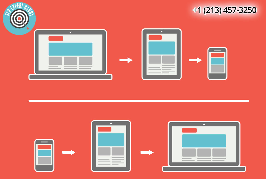
Can a Responsive Design Beat a Separate Mobile Site?
A mobile responsive design has transformed from being just an idea to philosophy. It has continued to change forward, and it’s getting stronger than ever. But why designers opt for responsive design, instead of choosing a separate mobile site?
It’s better for SEO.
Google suggests that responsive design is the best practice. And if Google recommends something, it’s usually a smart idea that designers must follow if they actually care about their site’s search rankings.
Employing responsive design offers more equity in backlinks. For example, if you use your mobile device when browsing an individual site, you may decide to share the link from your phone. However, the site’s link is a link to a mobile site. So, when you click this link using a full-size browser, you’ll be taken to the mobile site. If you’re not redirected, the content will look terrible.
And it’s vital to remember that a mobile site should have best user experience and SEO. In this way, your visitors won’t make a quick exit.
Also, having a separate mobile site will increase load time as your site will redirect to a mobile URL. With a responsive design, redirection isn’t an issue.

It is easier to maintain.
When your site has a lot of content, it can be a nightmare to transfer your content to multiple web properties. That is, you’ll spend more time, or you’ll need to pay someone to copy and format your content to multiple places.
But when your site is responsive, there’s no need for you to transfer it to another location. When you’re done creating or posting content, your task is finished.
It’s also future-proof as there’s no need to tweak it to fit on a popular new device. That will make sure that your site will always be optimized regardless of the screen size.
It provides better reading experience.
Mobile users will do everything that a desktop user will do as long as the content is presented in a beautiful, usable way. It’s also not okay to penalize your users with some missing features because they’re not using a full screen.
With a responsive design, all content is presented in an accessible way.
There are plenty more advantages of responsive design that allow it to beat having a separate mobile site. As more and more people are using their mobile devices to access websites, it’s clear to say that this trend won’t slow down in the future. That means every designer should think about how to create a better responsive design for their websites, instead of creating a separate mobile site.