What are the Breakpoints of a Responsive Web Design?
When it comes to deciding where to add breakpoints in responsive design, you might think about basing it on common screen sizes.
Unfortunately, there’s no such thing as “standard screen sizes.” Some might consider creating a breakpoint where the layout breaks. But no one could precisely determine whether the design is broken.
But you should not focus on device breakpoints. Instead, you must design for the smallest viewport first. Your best approach is to go mobile first. It lets you create your content that’s most relevant to your users in a logical way on smallest screen. Doing it this way will give you an understanding of the most important details on your site.
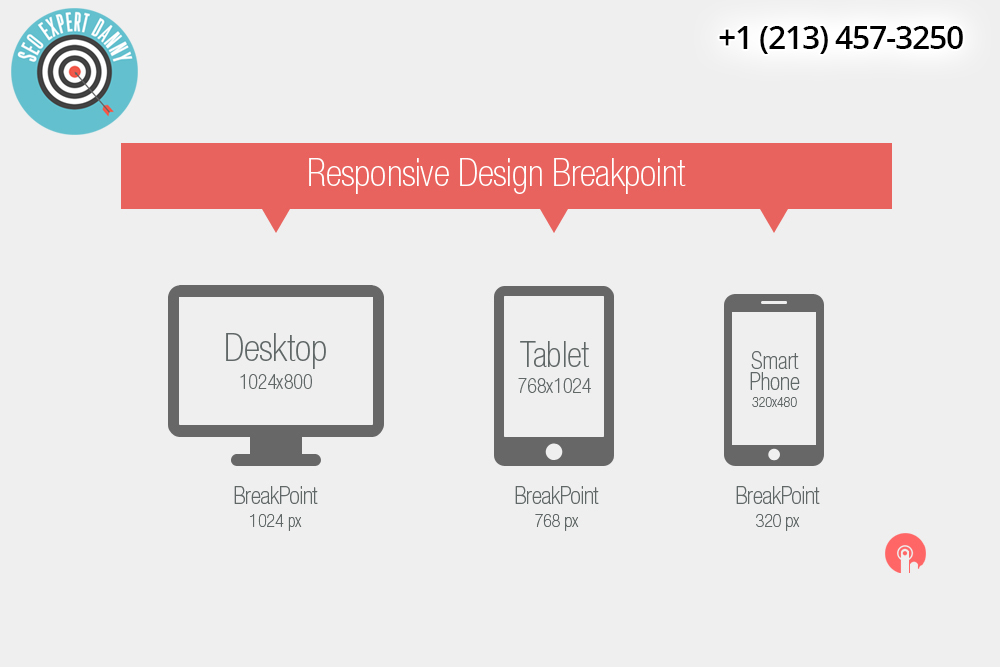
What device should you target?
None of them. The reason for this is that more and more devices are entering the market. As Google puts it, defining breakpoints according to a device class must only be used with caution. That’s because the result can be a maintenance nightmare for designers. Instead, Google recommends determining the breakpoints based on the content itself. You can start state from there in determining how your design’s layout should adjust to its container.
In other words, you should never create breakpoints on specific devices, brands or products. Rather, you must build them based on content. Then, make your design based on the smallest device first. Enhance it as the screen real estate becomes available.
Google also recommends keeping lines of text to a maximum of up to 80 characters.

Minor breakpoints
It’s also useful to adjust breakpoints for small changes. That is, you may modify the margins or padding on an element. Or you may choose to increase the font size. In this way, it’ll offer a more natural feel in the layout.
To optimize text for reading, you should consider having up to 80 characters per line. That’s about ten words in English. You should find a breakpoint if the width of the text block grows past ten words.
It’s also not a good idea to completely hide your content just because it won’t fit on the screen. Remember that a display size isn’t a definitive indication of the user’s want.
There are several ideas that you can use to create breakpoints for your responsive web design. However, starting with a small screen size can be an ideal way for you to get started. From there, you can go up so you can avoid creating dead zones in the media queries. This technique is also future-friendly.